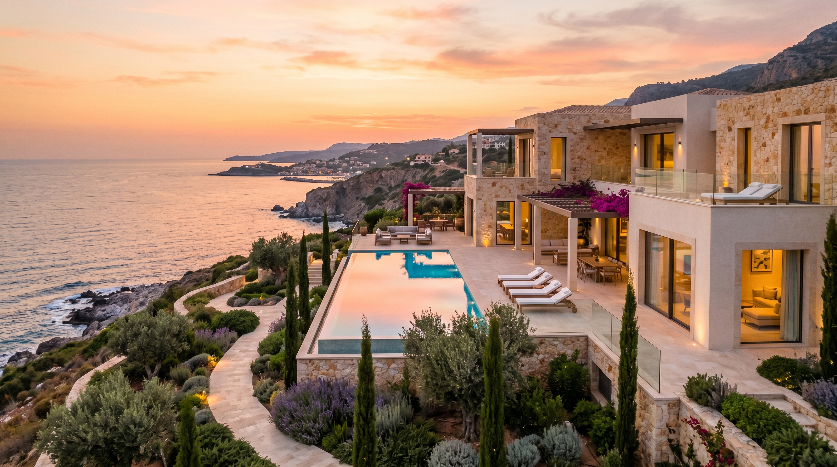
The property is legitimately exceptional. Hand-laid stone floors. A lap pool that catches the sunrise. A wine cellar stocked by a sommelier. Rates that start at $4,000 a night and fill a calendar eleven months in advance.
Then a prospective guest visits the website.
Comic Sans is not there, but everything else that signals "non-luxury" is. A header image that looks borrowed from Getty. Body copy in whatever font came with the theme. A booking widget with the same visual DNA as a budget hostel aggregator. A "Book Now" button competing with three other calls to action on the same screen.
The gap between what a property actually is and what its website communicates is a revenue problem. Not a cosmetic one. At $4,000 a night, a prospect who lands on a substandard site and bounces is a five-figure decision. Multiply that across a season and the cost of not fixing this becomes impossible to justify ignoring.
This post is about the specific patterns that signal "not actually luxury" to a high-intent guest, why those signals carry psychological weight in a premium purchase decision, and what a site that earns trust at this price point actually looks like.
The Six Design Tells That Quietly Undercut a Luxury Brand
1. Photography That Looks Like It Was Licensed, Not Shot
You can see the difference in three seconds. Stock-adjacent photography has a particular flatness to it. The light is even because it was added in post. The angles are symmetrical because the photographer was optimizing for catalog use, not for the way your infinity pool catches the 6:15 p.m. light in late July.
Guests booking at the $3,000-plus tier have visited enough premium travel sites to have a calibrated eye, even if they cannot articulate what they are seeing. What they are seeing is whether the photography was commissioned for this specific property or assembled from a library. Generic photography is a tell that the brand does not take itself seriously enough to invest in the thing guests are actually buying: an experience that exists nowhere else.
The fix is not just hiring a better photographer. It is directing a shoot that captures the property at its actual best. Timing matters. Seasonal light matters. The specific angle that makes the pool look like it extends to the horizon matters. One strong hero image from the right shoot is worth more than a gallery of competent but generic shots.
2. Template Aesthetics With Nowhere to Hide
Lodgify, Squarespace, and WordPress are legitimate tools. They are not premium hospitality design systems. The problem is not the platform. The problem is using a theme at factory settings and calling it a website.
Template aesthetics announce themselves through a combination of signals: uniform grid spacing that ignores the natural hierarchy of content, section dividers that exist because the theme put them there, color palettes that come from a preset rather than a brand identity, and padding values that feel like defaults because they are defaults.
At the budget end of the vacation rental market, this is fine. At the luxury end, it tells a guest that the attention to detail they will encounter during their stay is the same attention to detail that went into the website. That is the implication, whether you intend it or not. Luxury is expressed through specificity. Templates, by definition, are not specific.
3. Typography That Uses Whatever Came With the Theme
This one is subtle and it is not subtle at all.
The default font stack on most vacation rental themes is something like Inter, Open Sans, or a Google Fonts pairing that was popular in 2021. These are not bad typefaces. They are neutral typefaces. Neutral is the enemy of premium.
Typography in luxury hospitality does real work. The serif choices at Aman, Six Senses, or any boutique property with a real brand identity signal refinement before a single word is read. The weight, tracking, and size relationships between a headline and a subhead communicate deliberateness. When those relationships are absent or default, the page reads as assembled rather than designed.
If your site uses the same body font as a dental practice in Ohio, you have a typography problem.
4. A Booking Flow That Looks Like Airbnb Built It
This one gets overlooked because most STR operators think of the booking widget as purely functional infrastructure. It is not. It is brand infrastructure.
When a guest who is considering a $7,000 stay encounters a booking form that resembles the Airbnb checkout interface or a budget booking engine, the cognitive dissonance is immediate. The entire experience up to that point has been trying to position the property as exceptional. The booking form says "we use the same checkout as a $95-a-night condo in Kissimmee."
Premium hospitality sites treat the inquiry or booking flow as an extension of the brand. The form language is intentional. The field labels are specific to the experience. The button copy does not say "Book Now" in the same tone a SaaS trial signup would. The visual design of the form matches the visual system of the rest of the site.
This is not a technical limitation in most booking platforms. It is a design decision that does not get made.
5. Trust Badges That Signal the Wrong Things
"Superhost." "VRBO Verified." Padlock icons next to "Secure Checkout." SSL certificate badges. These signals exist because conversion optimization research at the mass-market end of the internet showed they reduced friction for skeptical buyers.
They are not appropriate signals for a property charging $10,000 a week.
At the luxury tier, trust is established through editorial quality, professional photography, articulate copy, and demonstrated specificity about the property and the experience. When you add a "Superhost" badge to a site selling a $5,000-a-night estate, you are reaching for social proof designed for the Airbnb ecosystem and applying it in a context where it reads as an insecurity signal rather than a credibility signal.
The implicit message is: "We feel we need to prove we are legitimate." A property that genuinely is legitimate at this tier does not reach for third-party validation badges. It lets the experience speak.
6. A Mobile Experience That Was Never Designed
Most vacation rental websites are built on desktop and then checked on mobile to confirm nothing is obviously broken. That is not mobile design. That is mobile QA.
The distinction matters because luxury purchase decisions increasingly happen on mobile. A guest browsing from a phone at dinner is making a real-time comparison between your property and three others. If your navigation collapses into a hamburger menu with no hierarchy, if your hero image crops to show a patch of ceiling, if your inquiry form requires horizontal scrolling to complete a field, you have already lost.
Mobile design at the premium tier means making deliberate decisions about what appears, in what order, at what size, on a small screen. Not "does it render?" but "does it feel considered?" The gap between those two standards is where most luxury rental sites fall short.
Why These Signals Carry Real Weight
High-consideration purchase decisions operate differently from low-consideration ones. When a guest is booking a $6,000 stay, the cognitive process involves much more active signal processing than a $90 purchase. Every element of the site is being read, consciously or not, as evidence for or against the claim the property is making about its own quality.
This is compounded by the absence of a physical touchpoint. The guest cannot see the property. They are making a significant financial decision based entirely on digital representation. The website is not marketing collateral that supports a sales process. It is the sales process.
Psychologists who study luxury purchase behavior consistently find that price alone does not justify premium positioning. Buyers need environmental cues that confirm the price is appropriate. A site that signals mass-market aesthetics creates a dissonance that a motivated buyer will resolve by looking elsewhere, not by booking anyway.
The properties that fill at high rates are not simply the ones with the most amenities or the best locations. They are the ones whose digital presence matches what the property actually delivers.
What a Premium Hospitality Site Actually Gets Right
The best luxury short-term rental sites share a set of design commitments that are worth naming directly.
Restraint over density. A premium site has negative space. It trusts the photography to do the persuasion and stays out of its way. When you feel compelled to add more content to a page, that is usually a sign the photography and copy are not doing their job, not a sign the page needs more.
Editorial photography as the first principle. Every image is shot specifically for this property and this site. The photography has a consistent point of view. It was directed, not captured.
Type systems with personality. The typography was chosen. The headline face has a reason to exist on this site and not on every other. The scale relationships between type sizes are deliberate.
Inquiry flows that match the tier. High-end properties benefit from inquiry flows over instant booking in many cases. The form is a filtering mechanism as much as a conversion point. Its design should communicate that both parties are evaluating fit, not just that a transaction is available.
Mobile as a first-class surface. The mobile experience is not the desktop experience made smaller. It is a considered presentation of the property for a different context.
Copy that is specific, not promotional. "Experience the pinnacle of luxury" tells a guest nothing. "The main suite faces east. The light is different here in the first hour of morning than anywhere we have ever stayed" tells a guest something true and specific. Specificity is the highest-converting copy strategy at this price point.
The Amase Stays Rebuild
This is exactly the problem we solved with Amase Stays.
The Amase team operates a portfolio of hand-selected properties at the premium end of the short-term rental market. The properties were exceptional. The website they had did not represent them accurately. It looked like a competent vacation rental site, which is a different thing from looking like a luxury hospitality brand.
The rebuild started with the brand foundation: what Amase is actually selling, articulated in a way that is distinct from the category language every other STR brand uses. From there, the design work built a visual system, type hierarchy, and editorial photography direction that match the quality of the properties themselves.
The result is a site that, when a prospective guest lands on it, immediately communicates that this is a different category of experience. You can see it at amasestays.com.
The properties did not change. The presentation did.
A Diagnostic Checklist: Run This on Your Own Site
Open your site right now and work through these questions honestly.
Photography
- Was every primary property image commissioned specifically for this site?
- Do your images have a consistent visual language and point of view?
- Does your hero image make someone stop scrolling?
Typography
- Is your typeface selection distinct from the default Google Fonts stack?
- Do your headline, subhead, and body copy have deliberate size and weight relationships?
- Does your type feel chosen or installed?
Template aesthetics
- Can you identify which theme or template your site is built on within thirty seconds?
- Are your spacing and layout decisions the result of design choices or default settings?
- Does your site look like it was built for this specific brand?
Booking and inquiry flow
- Does your booking or inquiry form match the visual system of the rest of your site?
- Does the form language feel specific to your property and audience?
- Could your checkout be mistaken for an OTA checkout?
Trust signals
- Are you displaying platform badges that belong in a mass-market context?
- Is your credibility established through quality and specificity rather than third-party icons?
Mobile experience
- Was your mobile experience designed, or just checked?
- Does your hero image crop correctly on a 375px screen?
- Can a guest complete an inquiry on mobile without friction?
If you answered honestly and found more than two or three issues, your site is costing you bookings. Not hypothetically. In actual, traceable revenue at the rates you are charging.
The good news is that every one of these problems is fixable. None of them require new properties, new rates, or a new business model. They require a website that represents what you have already built.
If your site has a gap between your property and its presentation, let us talk. This is one of the highest-leverage changes you can make to a premium rental business, and it usually takes less time than most owners expect.